Cadillac - Inset + Bleed

cadillac-lyriq
cadillac-lyriq
cadillac-lyriq
My Roles

Product Design
Manage Stakeholders

The Team

1 Product Designer
1 Product Manager
Many Developers

Tools

Figma

Timeline

4 months

Date

2023

My Roles

Product Design
Manage Stakeholders

The Team

1 Product Designer
1 Product Manager
Many Developers

Tools

Figma

Timeline

4 months

Date

2023

My Roles

Product Design
Managing Stakeholders

The Team

1 Product Designer
1 Product Manager
Many Developers

Tools

Figma

Timeline

4 months

Date

2023

Overview

Summary

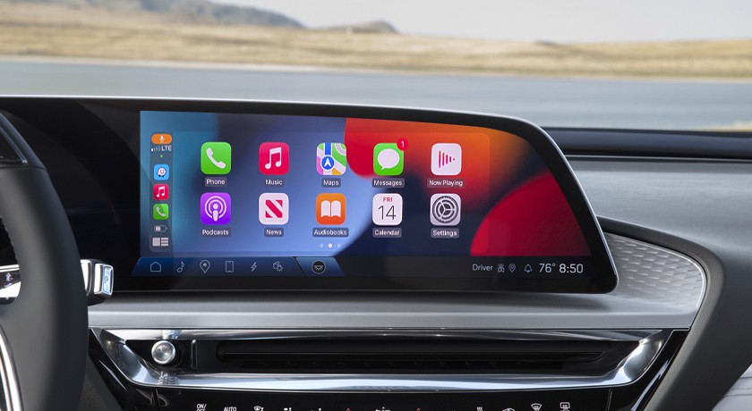
When General Motors announced a shift to EV’s, the Cadillac Lyriq was set to champion the new initiative with a new 33” freeform (non-rectangular) display. Previously, displays were small and rectangular with projection (Apple CarPlay / Android Auto) overtaking the entire screen.

With a new diagonal display sporting an angled side, carrying over the rectangle behavior would be a lackluster execution and feel unintegrated. This gap offered the opportunity to collaborate with Apple and Google to create “bleed” areas where the background could be extended past the initial UI, creating a more integrated experience for users.

I provided wireframes, user flows, defined new behaviors, and acquired UX certification with Apple and Google.

Impact

Through collaboration with partners, I helped define a new immersive experience that can now be used on irregular displays throughout the industry. Millions of users now have a more elegant and immersive experience that fully utilizes the display area.

Impact

Through collaboration with partners, I helped define a new immersive experience that can now be used on irregular displays throughout the industry. Millions of users now have a more elegant and immersive experience that fully utilizes the display area.

Impact

Through collaboration with partners, I helped define a new immersive experience that can now be used on irregular displays throughout the industry. Millions of users now have a more elegant and immersive experience that fully utilizes the display area.

Digging Deeper

How can I improve integration of partner UI?

How can I improve integration of partner UI?

How can I improve integration of partner UI?

Problem

Carrying over the previous implementation of partner UI (Apple CarPlay / Android Auto) showcases an incomplete experience and does not provide the most elegant integration in freeform (non-rectangular) displays.

Problem

Carrying over the previous implementation of partner UI (Apple CarPlay / Android Auto) showcases an incomplete experience and does not provide the most elegant integration in freeform (non-rectangular) displays.

Problem

Carrying over the previous implementation of partner UI (Apple CarPlay / Android Auto) showcases an incomplete experience and does not provide the most elegant integration in freeform (non-rectangular) displays.

Constraints

Physical display dimensions, reach curve, steering-wheel obstruction, partner experience certification requirements.

Constraints

Physical display dimensions, reach curve, steering-wheel obstruction, partner experience certification requirements.

Constraints

Physical display dimensions, reach curve, steering-wheel obstruction, partner experience certification requirements.

Project Goals

Seamlessly integrate partner UI

Get partner buyoff

Create a process moving forward

Analysis and Iteration

Seamlessly integrate partner UI

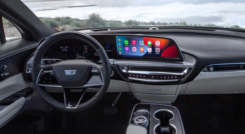
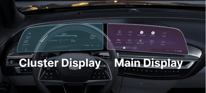
Setting the stage: the 33” diagonal display was a new frontier where both the cluster (what’s behind the steering wheel showing real time vehicle data) and main display (screen in the center where all the fun stuff is) are a single screen.

Analysis and Iteration

Seamlessly integrate partner UI

Setting the stage: the 33” diagonal display was a new frontier where both the cluster (what’s behind the steering wheel showing real time vehicle data) and main display (screen in the center where all the fun stuff is) are a single screen.

Analysis and Iteration

Seamlessly integrate partner UI

Setting the stage: the 33” diagonal display was a new frontier where both the cluster (what’s behind the steering wheel showing real time vehicle data) and main display (screen in the center where all the fun stuff is) are a single screen.

image-showing-cluster-and-main

Due to safety regulations and one single screen, using the previous method where partner UI overtakes the entire display was no longer possible because it would cover critical driver information.

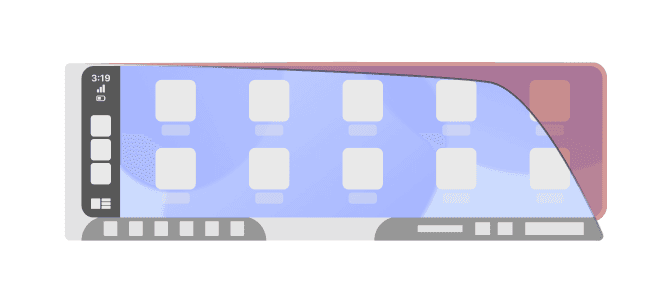
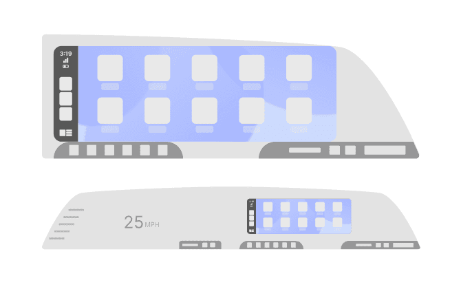
The initial thought is to extend the partner UI as large as possible in the main display area and butt it against the edges. This unfortunately created trapped space that was not aesthetically pleasing and appeared wasted. There was also a thought to reduce the UI size and create a white space border. This was an improvement to the trapped space, but went against partner requirements and due to the wide display, it appeared to float - looking like an afterthought.

image-of-unacceptable-ui-placement

So now I have an angled screen, a sad rectangle, and an idea - what if there was a way to fill that trapped space? I wish it was as easy as: “just make it bigger”. However, extending the size of the UI would shift apps out of the driver reach curve and would also obstruct apps / phone information near edges.

So now I have an angled screen, a sad rectangle, and an idea - what if there was a way to fill that trapped space? I wish it was as easy as: “just make it bigger”. However, extending the size of the UI would shift apps out of the driver reach curve and would also obstruct apps / phone information near edges.

So now I have an angled screen, a sad rectangle, and an idea - what if there was a way to fill that trapped space? I wish it was as easy as: “just make it bigger”. However, extending the size of the UI would shift apps out of the driver reach curve and would also obstruct apps / phone information near edges.

over-extended-app-area

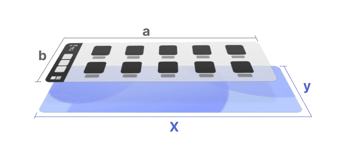
I needed a way to keep the integrity of the projected UI while still filling the display. This led to the option of separating the background from the interactable part of the UI and the ability to define the size of each independently - extending only the background.

I needed a way to keep the integrity of the projected UI while still filling the display. This led to the option of separating the background from the interactable part of the UI and the ability to define the size of each independently - extending only the background.

I needed a way to keep the integrity of the projected UI while still filling the display. This led to the option of separating the background from the interactable part of the UI and the ability to define the size of each independently - extending only the background.

seperation-safe-and-background

Iteration

Get partner buyoff

At the time, there was no feature option to treat the background separately, so I would have to bring this feature proposal to the partners. First, collaborating with my own software team to make sure the proposal is feasible in our own system if partners implemented the right kind of API’s.

With a strong proposal and concept mockup, I collaborated with the Apple and Google teams to work out how it could be implemented and tracked for certification. The partners agree to do the work on their end, while we prepared for the changes on ours. Teamwork makes the dream work and now we were on our way to having the necessary API’s needed to declare background and foreground separately.

mockup-of-design
mockup-of-design
mockup-of-design
Create a process moving forward

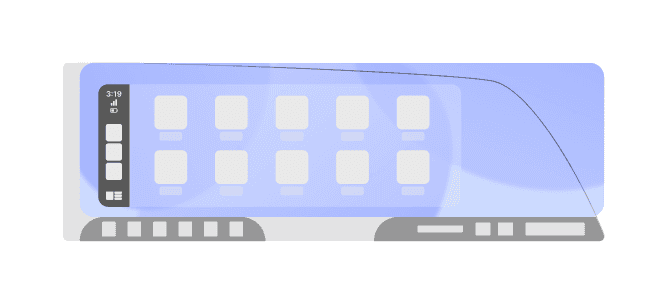
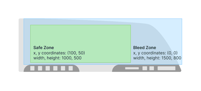
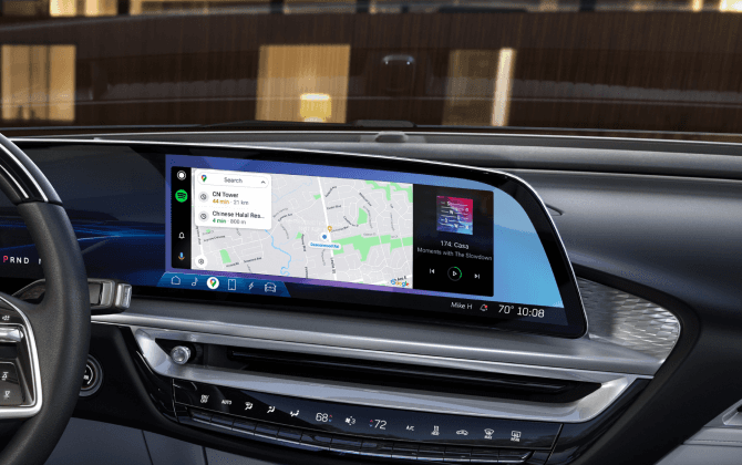
When implementing this new feature where the background is defined separately, it essentially creates two layers to the UI - a safe zone and bleed area. The safe zone is where the apps live and users can interact with the partner UI (how it was originally). The new bleed zone is where the background or wallpaper area can be over-extended to fill irregular display shapes.

With new features and implementation, comes new requirements and certification declarations. At the time, partner UI requirements boiled down to: their UI taking up as much space as possible sitting on top of the native UI. With the new, wider screens, it’s a more integrated experience with the partner UI shown among other native elements.

Among other considerations, now it's necessary to define the dimensions for both safe and bleed areas to correctly display the UI. At a base level I would define the width and height, but with multiple layers it was also important to declare the coordinate (x,y) values of where to begin the safe and bleed zones to implement the desired effect. That's an over-simplification of the updated process and requirements for sanity and confidentiality sake.

image-of-unacceptable-ui-placement

Final Images

Please note: final product may differ due to over the air updates.

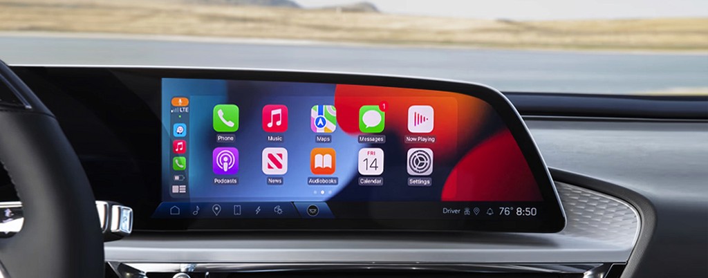
cadillac-lyriq-zoomed-carplay
android-auto-mockup
android-auto-mockup
android-auto-mockup
cadillac-lyriq-interior-carplay

Reflection And Future Goals

In each program, the goal for partner UI is to give the user the largest possible integrated experience that appears elegant and seamless with the native system. This was uncharted territory introducing a completely new type of display where I had to analyze current limitations, ideate on improvements, and work closely with partners to create solutions that deliver value to the customer.

I think this design implementation is successful, looks great, and functions well in vehicles using irregular shaped displays.
  1. View Project
  2. 01
  3. 02
  4. 03
  5. 04
  6. 05
  7. 06
  8. 07
  9. 08
  10. 09

I appreciate the interest.

Let's connect.

I appreciate the interest.

Let's connect.